Exploratory Data Analysis

Zulquar Nain

What is EDA ?

  • Statistical approach of analyzing datasets and summarizing their main characteristics.

  • Statistics and visualization techniques used to explore data and discover patterns.

  • main idea is to better understand the data.

Indian Stock Market - A Case Study

  • Indian sectoral Indices

  • The dataset comprises three sectoral indices from 2020 to 2025

R packages required

# To attach the package
library(tidyverse)
library(quantmod)
library(tidyquant)
library(broom)
library(ggpubr)
library(zoo)
library(corrplot)
library(tseries)
library(car)

Questions to Explore

  1. What is the overall trend in sector indices from 2020 to 2025?
  2. Are daily returns normally distributed?
  3. Is there a significant difference between average returns of sectors?
  4. Are sector returns correlated?
  5. Can we predict Bank returns based on IT and FMCG returns?

1. Import the data

# Define the list of sector symbols (from Yahoo Finance)
symbols <- c("^NSEBANK", "^CNXIT", "^CNXFMCG")

# Download data for each symbol from Yahoo Finance
# getSymbols() fetches the historical price data
# Here map() is for looping that is downloads stock data for each symbol and collects all the results into a list called data_list
# .x is just a placeholder. Typically, .x is used inside functions like purrr::map() or lapply(), where it represents each element of a list or vector you are looping over.

data_list <- map(
  symbols,
  ~ getSymbols(.x, src = "yahoo", from = "2020-01-01", 
               to = Sys.Date(), auto.assign = FALSE)
)

# Assign readable names to the downloaded data
# This matches the downloaded list to sector names
names(data_list) <- c("NIFTY_BANK", "NIFTY_IT", "NIFTY_FMCG")

# Convert each stock data into a tidy format
# Extract columns, rename them, add the Date and Sector Index
sector_tbl <- map2(data_list, names(data_list), ~ {
  
  # Convert xts object to tibble (dataframe)
  df <- as_tibble(as.data.frame(.x))
  
  # Rename the columns for clarity
  colnames(df) <- c("Open", "High", "Low", "Close", "Volume", "Adjusted")
  
  # Add the Date column (index of xts object)
  df <- df %>% mutate(Date = index(.x))
  
  # Add a new column "Index" to identify the sector
  df %>%
    mutate(Index = .y) %>%
    select(Date, Index, Close)   # Keep only relevant columns
})

# Combine all sectors into one dataframe
# Bind rows of all sector tibbles into a single dataframe
sector_df <- bind_rows(sector_tbl)

# Ensure the Date column is in Date format
sector_df$Date <- as.Date(sector_df$Date)

# View the structure of sector_df
glimpse(sector_df)
Rows: 3,912
Columns: 3
$ Date  <date> 2020-01-02, 2020-01-03, 2020-01-06, 2020-01-07, 2020-01-08, 202…
$ Index <chr> "NIFTY_BANK", "NIFTY_BANK", "NIFTY_BANK", "NIFTY_BANK", "NIFTY_B…
$ Close <dbl> 32443.85, 32069.25, 31237.15, 31399.40, 31373.65, 32092.40, 3209…

2. Overall Trend in Sector Indices

sector_df %>%
  ggplot(aes(x = Date, y = Close, color = Index)) +
  geom_line() +
  labs(title = "Sector Indices Closing Prices (2020-2025)", x = "Date",
       y = "Closing Price (INR)") +
  theme_minimal()

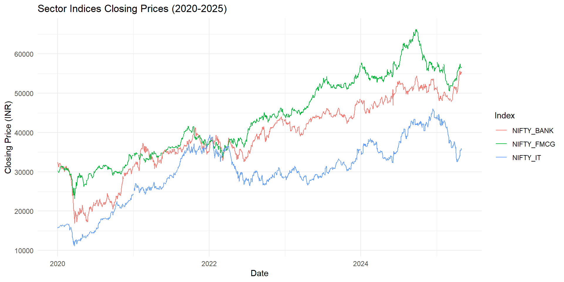
Interpretation: All sectors show upward trends with some volatility, especially Banking.

3. Calculating Daily Returns

sector_returns <- sector_df %>%
  group_by(Index) %>%
  arrange(Date) %>%
  mutate(Return = (Close / lag(Close)) - 1) %>%
  drop_na()
# View the structure of sector_df
glimpse(sector_returns)
Rows: 3,849
Columns: 4
Groups: Index [3]
$ Date   <date> 2020-01-03, 2020-01-03, 2020-01-03, 2020-01-06, 2020-01-06, 20…
$ Index  <chr> "NIFTY_BANK", "NIFTY_IT", "NIFTY_FMCG", "NIFTY_BANK", "NIFTY_IT…
$ Close  <dbl> 32069.25, 15936.60, 30109.25, 31237.15, 15879.80, 29799.30, 313…
$ Return <dbl> -0.0115460901, 0.0144464844, -0.0051856270, -0.0259469619, -0.0…

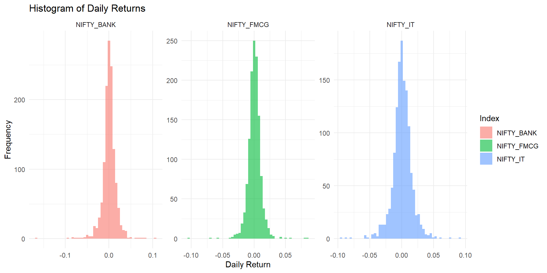
4. Distribution of Daily Returns

sector_returns %>%
  ggplot(aes(x = Return, fill = Index)) +
  geom_histogram(bins = 50, alpha = 0.6, position = "identity") +
  facet_wrap(~Index, scales = "free") +
  labs(title = "Histogram of Daily Returns", x = "Daily Return",
       y = "Frequency") +
  theme_minimal()

5. Normality Check with QQ Plot

sector_returns %>%
  ggqqplot(x = "Return", facet.by = "Index", color = "Index", add = "qqline")

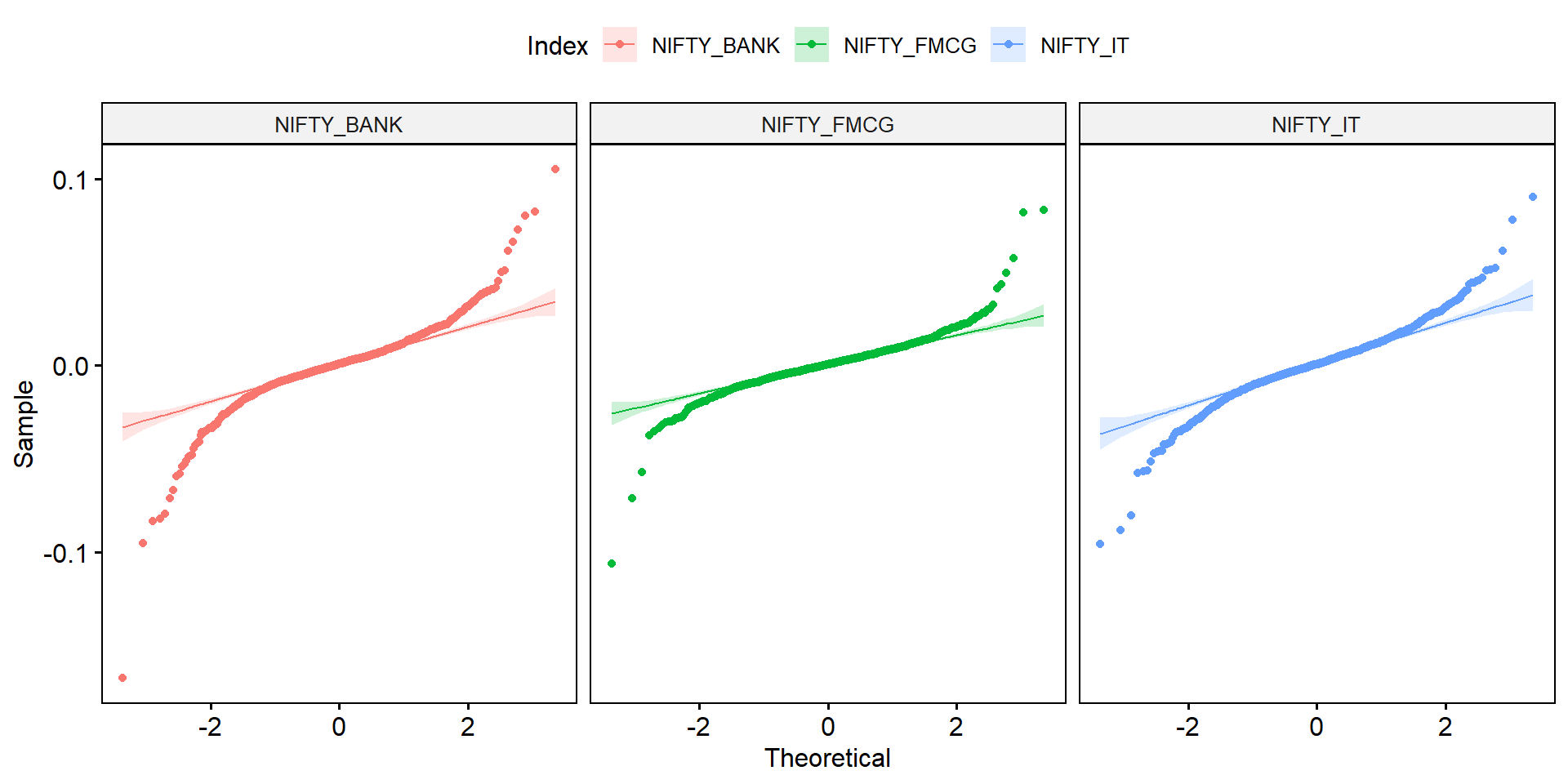
Interpretation: Returns show deviation from perfect normality, common in financial data.

6. Hypothesis Testing - Are Average Returns Different?

# ANOVA Test
anova_test <- aov(Return ~ Index, data = sector_returns)
summary(anova_test)
              Df Sum Sq   Mean Sq F value Pr(>F)
Index          2 0.0000 1.895e-05   0.095  0.909
Residuals   3846 0.7682 1.997e-04               

Interpretation: If p-value < 0.05, we reject the null hypothesis and conclude that mean returns differ across sectors.

7. Correlation Analysis

# Reshape returns to wide format
returns_wide <- sector_returns %>%
  select(Date, Index, Return) %>%
  pivot_wider(names_from = Index, values_from = Return)

# Correlation matrix
cor_matrix <- cor(returns_wide %>% select(-Date), use = "complete.obs")

# Correlation plot
corrplot(cor_matrix, method = "color", type = "upper", 
         addCoef.col = "black", tl.cex = 0.8, number.cex = 0.7,
         title = "Correlation Between Sector Returns", mar = c(0,0,1,0))

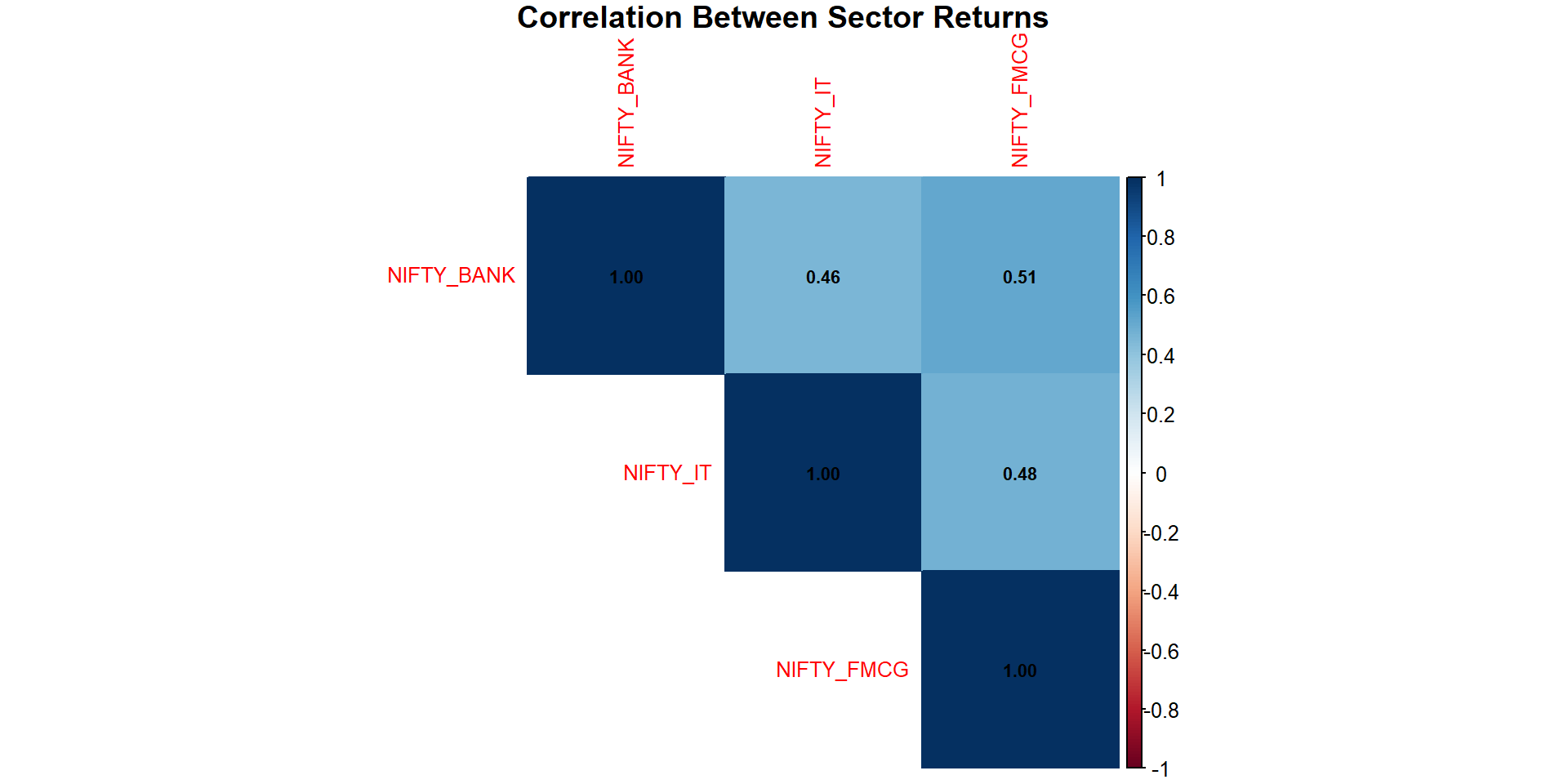
Interpretation: Positive correlations imply that sectors often move together. Banking and IT sectors show moderate correlation.

8. Predict Banking Returns using Regression Analysis

# Simple regression model
regression_model <- lm(NIFTY_BANK ~ NIFTY_IT + NIFTY_FMCG, data = returns_wide)
summary(regression_model)

Call:
lm(formula = NIFTY_BANK ~ NIFTY_IT + NIFTY_FMCG, data = returns_wide)

Residuals:
      Min        1Q    Median        3Q       Max 
-0.083107 -0.006657 -0.000179  0.006313  0.069545 

Coefficients:
              Estimate Std. Error t value Pr(>|t|)    
(Intercept) -5.336e-05  3.708e-04  -0.144    0.886    
NIFTY_IT     2.890e-01  2.798e-02  10.329   <2e-16 ***
NIFTY_FMCG   5.722e-01  3.930e-02  14.559   <2e-16 ***
---
Signif. codes:  0 '***' 0.001 '**' 0.01 '*' 0.05 '.' 0.1 ' ' 1

Residual standard error: 0.0132 on 1268 degrees of freedom
  (18 observations deleted due to missingness)
Multiple R-squared:  0.3215,    Adjusted R-squared:  0.3205 
F-statistic: 300.5 on 2 and 1268 DF,  p-value: < 2.2e-16

Interpretation: - Coefficients tell us how much Bank returns change with IT and FMCG. - If p-values < 0.05, predictors are significant. - Adjusted R-squared shows goodness of fit.

9. Final Inference

Summary: - All sectors have shown an overall upward trend. - Returns are not perfectly normal. - There are significant differences in sector returns. - Sector returns are moderately correlated. - IT and FMCG sector returns are useful predictors of Bank sector returns.

Conclusion: Investors can use sector correlations and predictive models for portfolio diversification and risk management.

THANKS